Thursday, August 18, 2011

Closer artwork


An Accomplished Woman (Apparently)

2011
Collage
6 x 8cm (approx)

Look closer...


Earlier this month, I had a teeny tiny two-dimensional art piece exhibited in a group show put on by Brisbane gallery/art space the Wandering Room. The exhibition aptly titled 'Closer' presented viewers with a diverse array of works all made and produced within the scale requirements of 8 x 8 x 8 cm. What I like about the concept behind this exhibition is that it does not attempt to be loud and obnoxious. Sometimes proposing 'large scale' projects can take you away more from the glowing, nucleic idea in the centre. The accentuation of scale at the tiny end of the spectrum spurs on a kind of 'stopped in your tracks' or 'did I just see that?'moment. Which is what I love about Slinkachu's work for example. In 'Closer' my artwork titled An Accomplished Woman (Apparently) was installed in what appears to be the down stairs living room perhaps...lovely! See for yourself right here


Wednesday, August 10, 2011

New assemblage pieces


Some of these may change or have things layered on top. But my assemblage making process has slowed a little post 'Assembling Worlds' exhibition to allow for extra proposal writing/planning time. Enjoy

Saturday, August 6, 2011

Semi Permanent sidelinin' - ETCC


Hey there,

Heard of Semi-Permanent? With the annual art/design convention extravaganza now spurring on various sideline events, this year I've made the bill for one of the Brisbane sideshows. Run through ETCC and funded by Creative Commons and the Australia Council for the Arts, this show is all about the creative remix. We know a remix in the context of music, but what if that idea was translated to artwork and other cross disciplinary creative mediums? Well if you want to see some fresh and funky outcomes of this progressive and experimental idea, head to the Shooting Gallery

The ETTC show installed at the Shooting Gallery, is up and running for three weeks before the works are subsequently passed on to the selected Melbourne artists for remixing. So if you're swanning about the CBD looking for some visual stimulation and cultural refreshing, walk 10mins up from Central Station (up Creek St into Spring Hill) and turn left into Bowen Street.

Enjoy!

Thursday, July 14, 2011

Oh Sally

I've been researching Sally Smart a lot recently and love, love, love her work and approach to making art. Silhouettes, cut-outs, feminine identity, pirates....mmmm. I reckon she is a little bit unsung in the Australian art scene, maybe that is testament to the observation that painters might still be leading the charge? Well anywho, if you haven't seen her work before check it out here


I've got an itch for a triptych


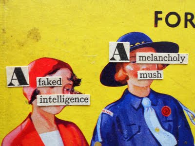
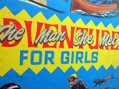
Having a jab at the era of political incorrectness present of children's fiction. The 'Adventure' or 'Budget for Girls...' (circa 1930s-1960s) type books as they were often called, were most likely produced for quiet, sensible summer holiday reading. The stories often focused on well behaved teenage protagonists who fluttered around solving mysteries, stumbling across smuggled narcotics and winning table tennis tournaments. I've collected a number of these stories and use them in the collage cut/extract processes. But it was only recently that I became interested in the dust covers. I had previously thought of this part of the book as untouchable and that if I was going to be cutting up and shredding old even rare books, that I should at least 'leave the shell' as a kind of legacy to the object. Then I thought that the covers were the real 'selling point' of the books. Bright, cheerful illustrations emblazon the colours and many appear undiminished despite their old age. Some are also still marked with the signature of a previous owner.

So, I became interested in taking the mick out of the air-headed/white girl/private school saturated stories by layering contrasting text phrases and titles over the top of the covers. It didn't matter to me anymore that I was tearing the covers off some of these books. In 'The Other Side of Storyland', the titles and figurative conditions of the covers are altered to evoke a different side to the 'beautiful good girl' protagonists in the stories. On a personal level, the best books I read as a young girl and teenager were the ones that I could relate to on an emotional level or (not to sound wanky) that empowered me...even if was in a small way. So this triptych pokes fun but also reveals the vulnerability of the fictional characters in the aforementioned old Adventure/Girls books. While these characters were independent and wholesome, they were also falling into the arms of pilots and boys from grammar schools. So I can see the little ways in which the old stories sought to set a good example to the young female readers, they were also conditioning them subtly. The underlying aspirations towards gender specific jobs (secretaries, typists, nurses), romance and domestic life were definitely evident between the lines. The triptych therefore attempts to contrast romantic pre-60s bedroom dreams with the 'Adventure' and 'Storyland' titles (romance and girly giggles overriding independence), whilst also deconstructing and rehashing snippets of text to present a short description that alludes to a naughty, perhaps even sexually experimentive side to the protagonist's personality.

Monday, July 4, 2011

New collaborative and individual works: count down to ASSEMBLING WORLDS


From top:

'Kidnapped'
2011
Collage.

'Faz and the Revolution'
2011
Collage.

'From Tokyo with Love'
2011
Collage
Collaboration with Warren Handley.

'Call Me When You Get In'
2011
Collage
Collaboration with Warren Handley.